First Bank
First Bank
First Bank
Project
First Bank
Project Type
UI/UX Design
Duration
2 Months
Year
2022
Project
First Bank
Project Type
UI/UX Design
Duration
2 Months
Year
2022
Project
First Bank
Project Type
UI/UX Design
Duration
2 Months
Year
2022
Project
First Bank
Project Type
UI/UX Design
Duration
2 Months
Year
2022
Overview
Overview
Overview
First Bank Nigeria, a leading financial institution, sought to enhance its mobile app's user experience to provide seamless and secure banking services. The redesign focused on improving the login process, adding password recovery options, allowing users to hide their account balance, and reorganising the menu bar for effortless accessibility.
First Bank Nigeria, a leading financial institution, sought to enhance its mobile app's user experience to provide seamless and secure banking services. The redesign focused on improving the login process, adding password recovery options, allowing users to hide their account balance, and reorganising the menu bar for effortless accessibility.
First Bank Nigeria, a leading financial institution, sought to enhance its mobile app's user experience to provide seamless and secure banking services. The redesign focused on improving the login process, adding password recovery options, allowing users to hide their account balance, and reorganising the menu bar for effortless accessibility.
Project Goals and Objectives:
Project Goals and Objectives:
Streamlined Login Process:
Streamlined Login Process:
Develop a login screen that significantly reduces friction for users, enabling them to access their accounts quickly and conveniently.
Develop a login screen that significantly reduces friction for users, enabling them to access their accounts quickly and conveniently.
User-Friendly Password Recovery:
User-Friendly Password Recovery:
Implement a simple and intuitive password recovery process that allows users to regain account access swiftly without unnecessary hassle.
Implement a simple and intuitive password recovery process that allows users to regain account access swiftly without unnecessary hassle.
Account Balance Privacy:
Account Balance Privacy:
Introduce an optional feature that enables users to hide their account balance on the app's home screen for enhanced privacy and security.
Introduce an optional feature that enables users to hide their account balance on the app's home screen for enhanced privacy and security.
Redesigned Menu Bar:
Redesigned Menu Bar:
Restructure the menu bar content into logical groupings to facilitate easy navigation and ensure that users can access their desired features effortlessly.
Restructure the menu bar content into logical groupings to facilitate easy navigation and ensure that users can access their desired features effortlessly.
Restructure the menu bar content into logical groupings to facilitate easy navigation and ensure that users can access their desired features effortlessly.
The goal of the project were to:
The goal of the project were to:
Create a seamless and secure mobile banking experience that delights customers and builds trust in the app's functionality. By addressing pain points and enhancing user experience.
Create a seamless and secure mobile banking experience that delights customers and builds trust in the app's functionality. By addressing pain points and enhancing user experience.
Design Process
After recognizing the limitations of not being able to recover one's password seamlessly and securing users' privacy while using the First Bank mobile App, I realized that I might not be the only one facing this challenge. There could be other users who are also struggling with this issue. To avoid personal bias and gain insights into the behaviors of other users in relation to this pain point. l decided to conduct a UX research study.
Wireframes
Wireframes
Using wireframes, we iteratively designed the login screen, password recovery process, and account balance settings.
Using wireframes, we iteratively designed the login screen, password recovery process, and account balance settings.
Visual Design
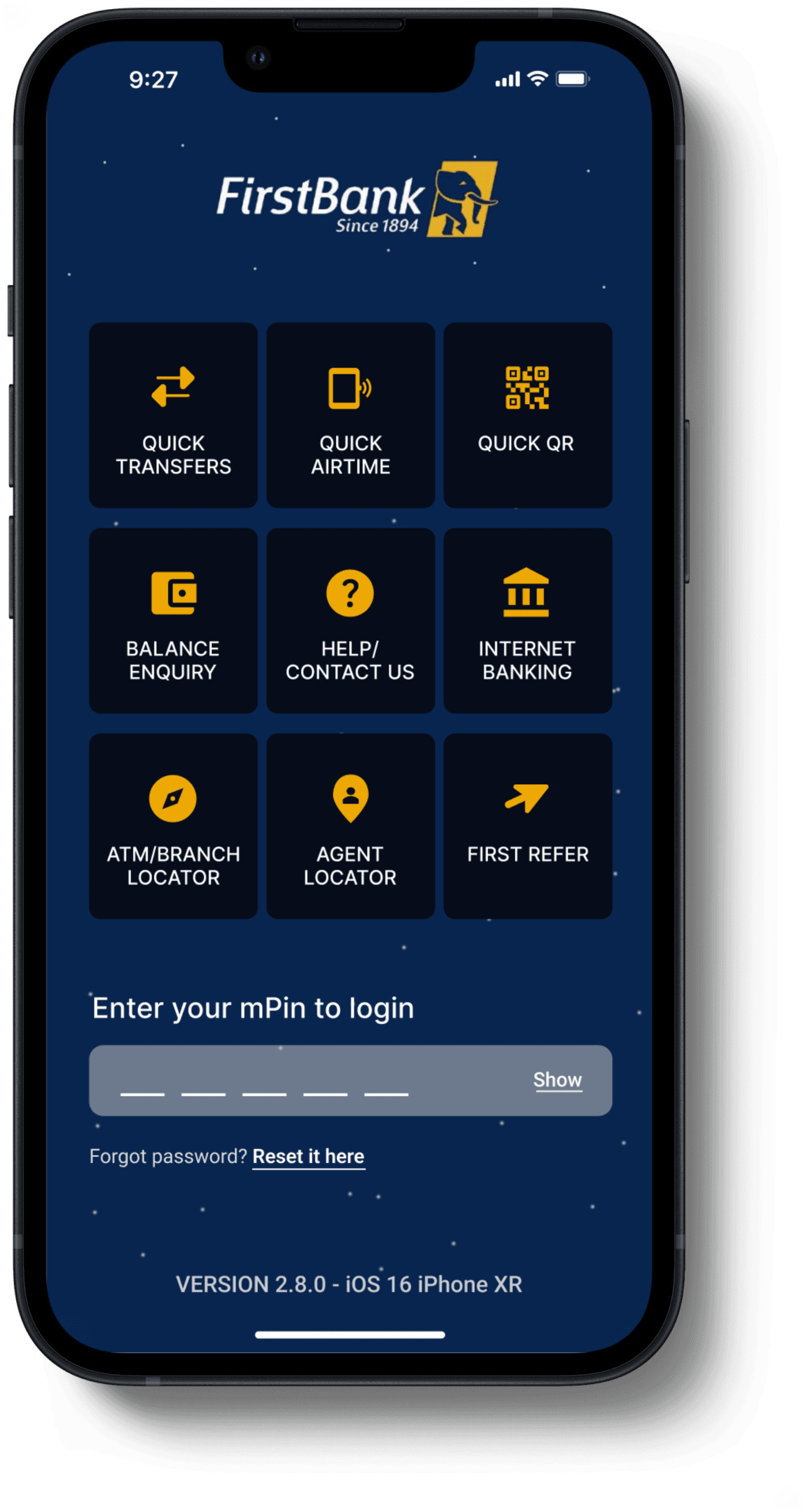
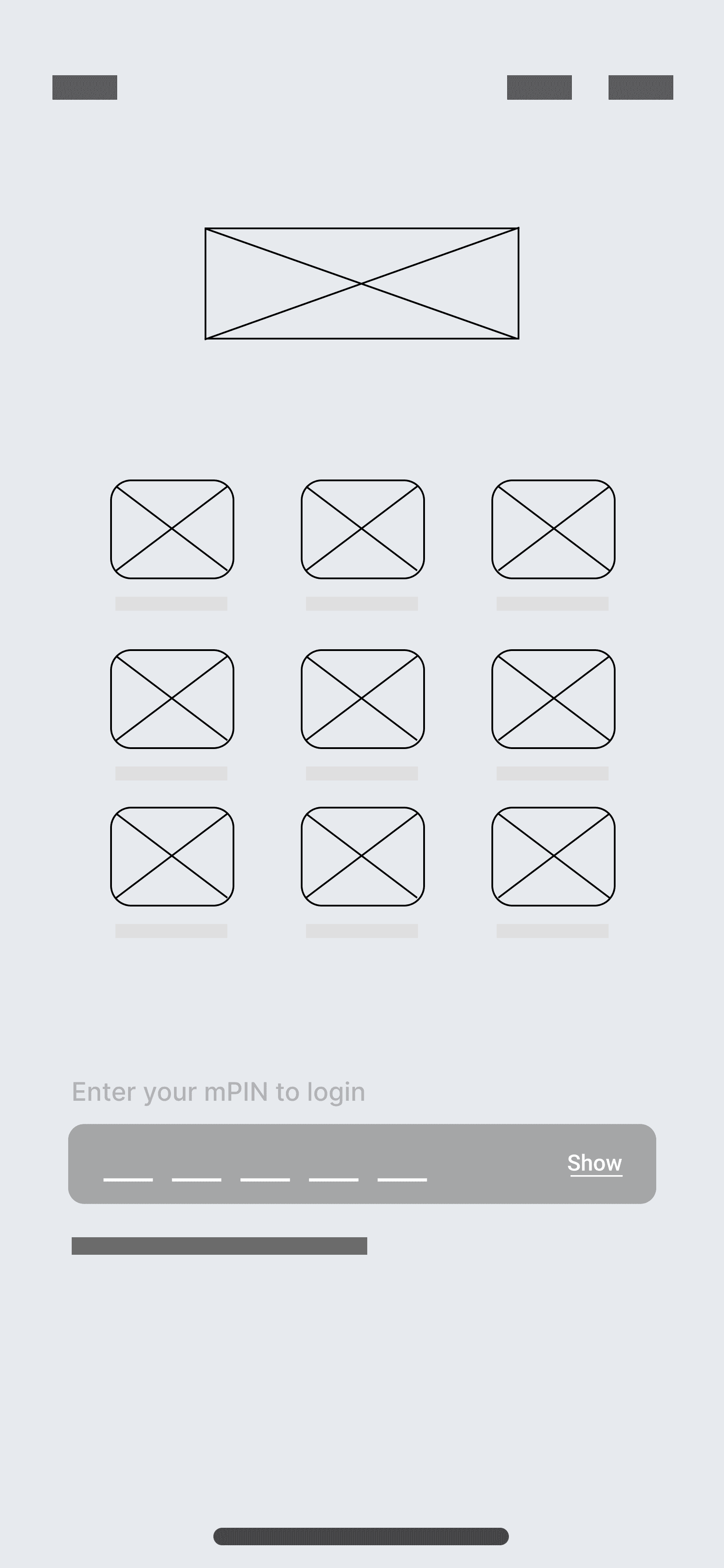
Login screen
From the Login screen, users who have forgotten their password get access to reset their password.

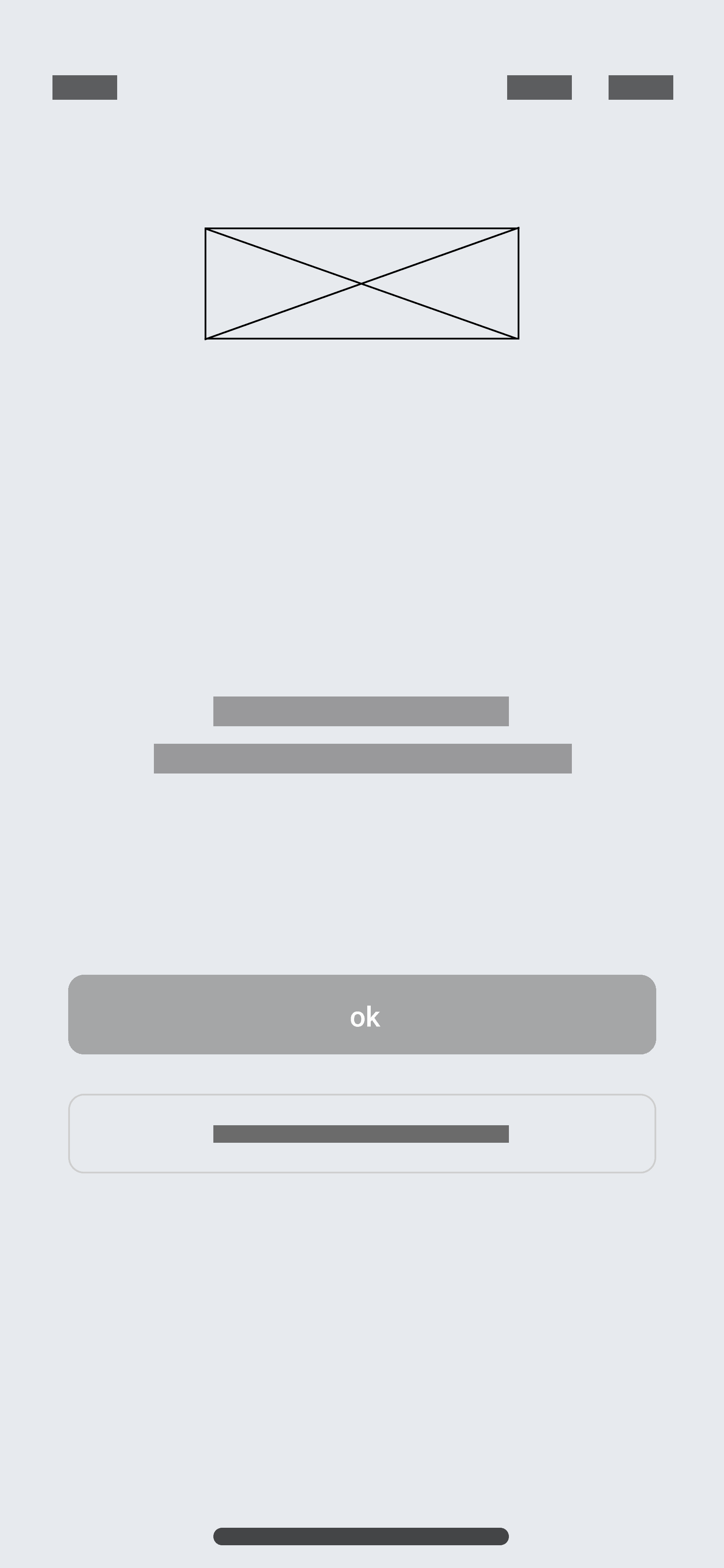




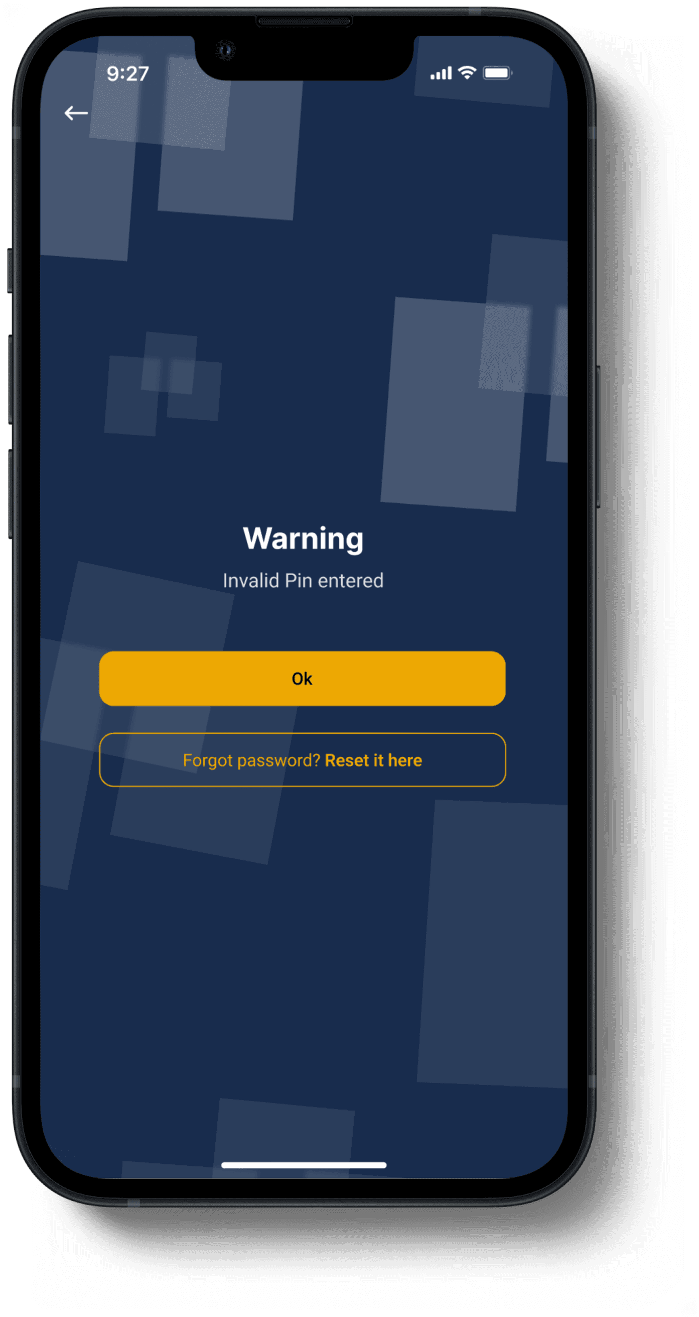
Pin warning page
The Invalid pin warning page helps users who have forgotten their password get access to reset their password, Unlike the form that doesn't offer users the option to reset their password.
Visual Design
Login screen
From the Login screen, users who have forgotten their password get access to reset their password.


Pin warning page
The Invalid pin warning page helps users who have forgotten their password get access to reset their password, Unlike the form that doesn't offer users the option to reset their password.


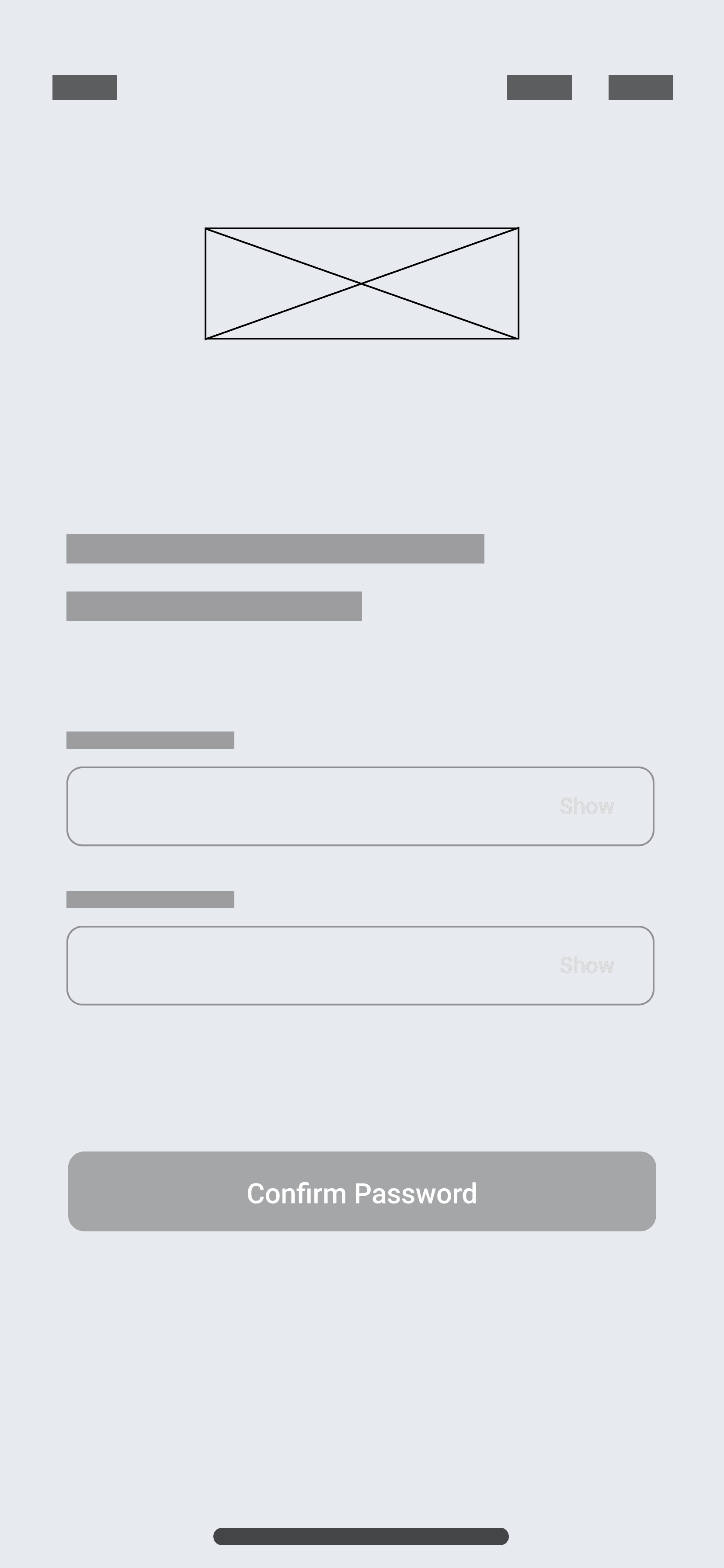
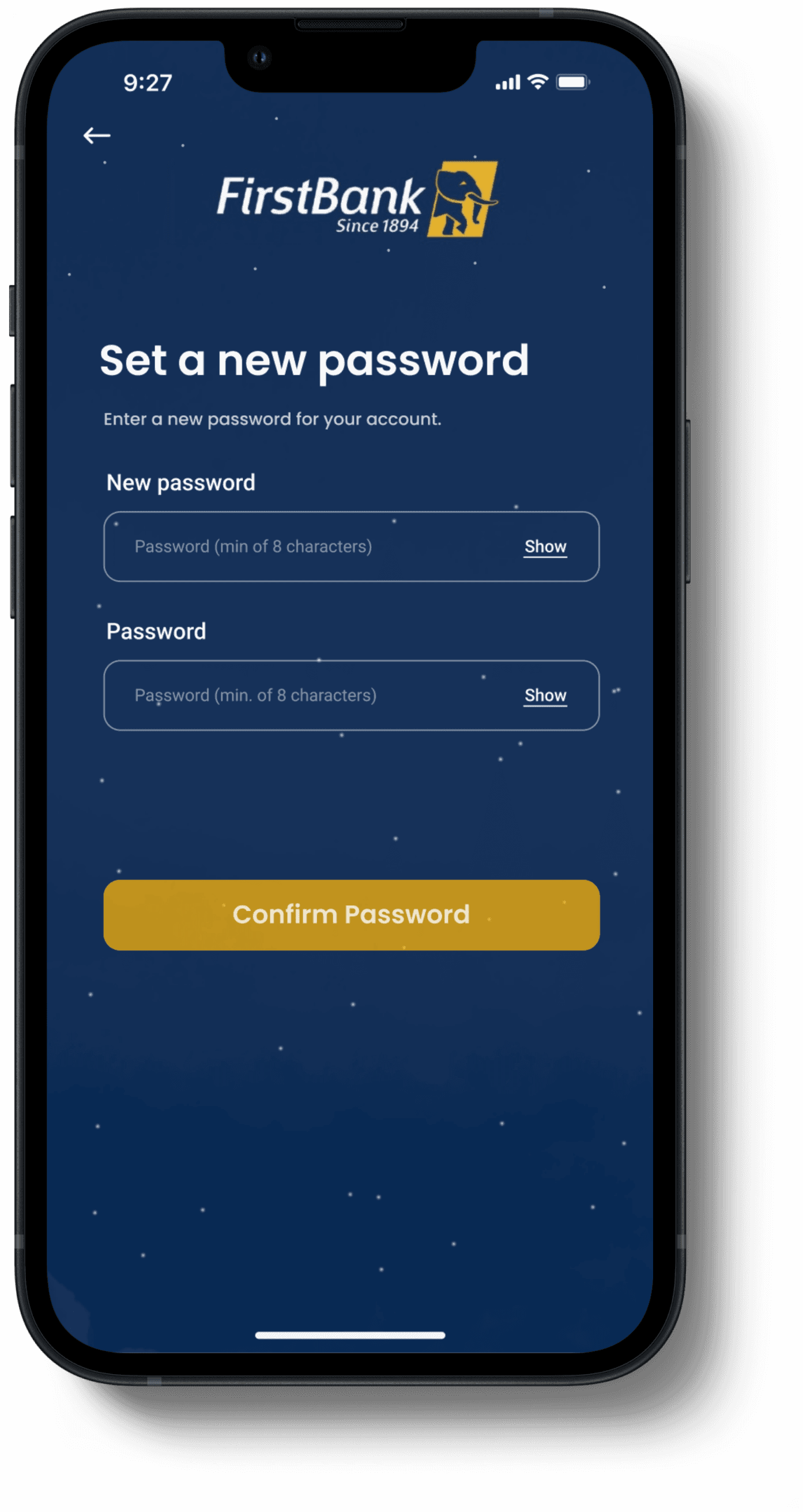
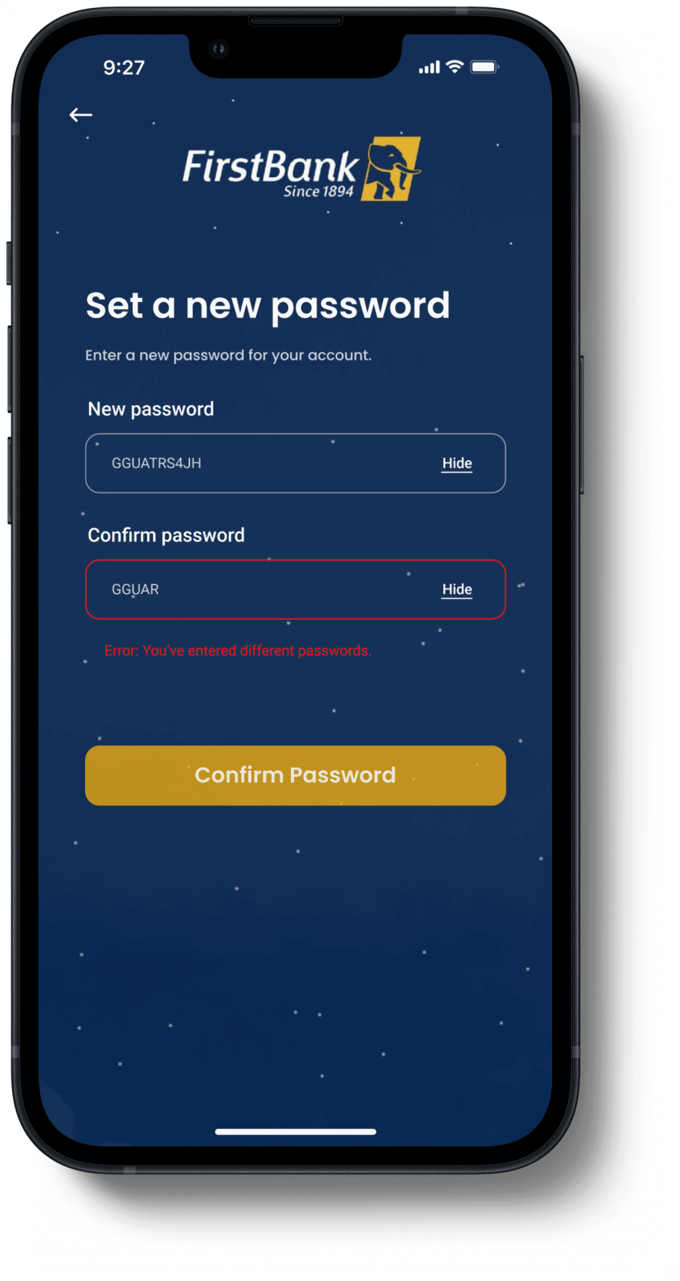
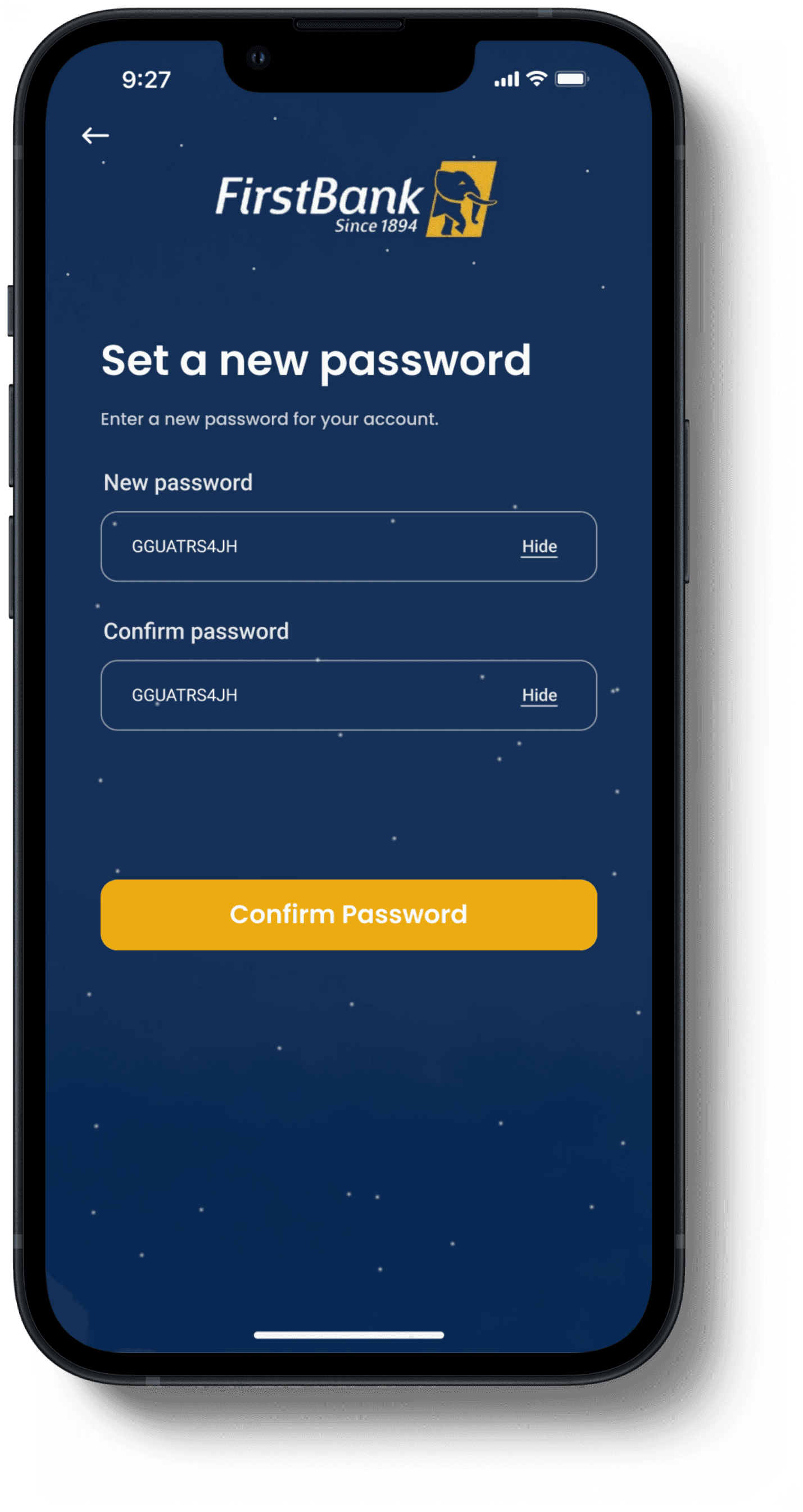
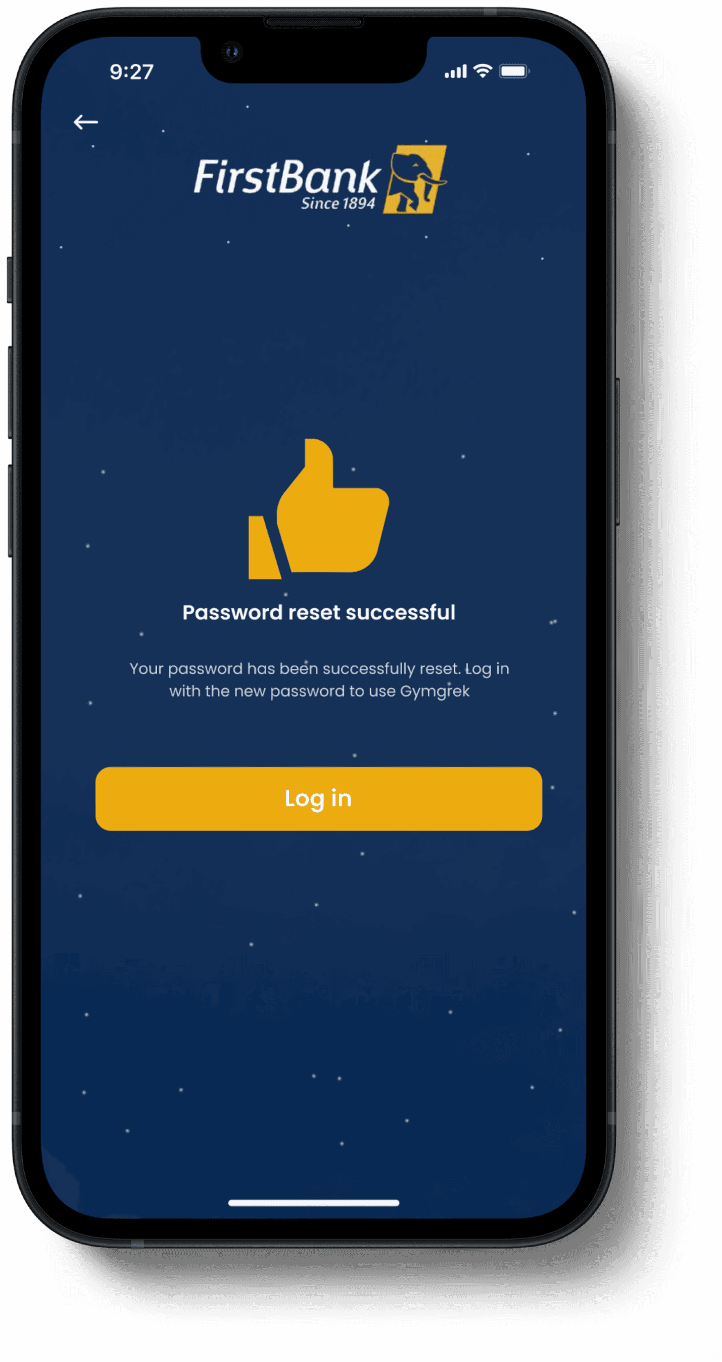
Pin reset page
This screens allows users who have forgotten their password reset it.








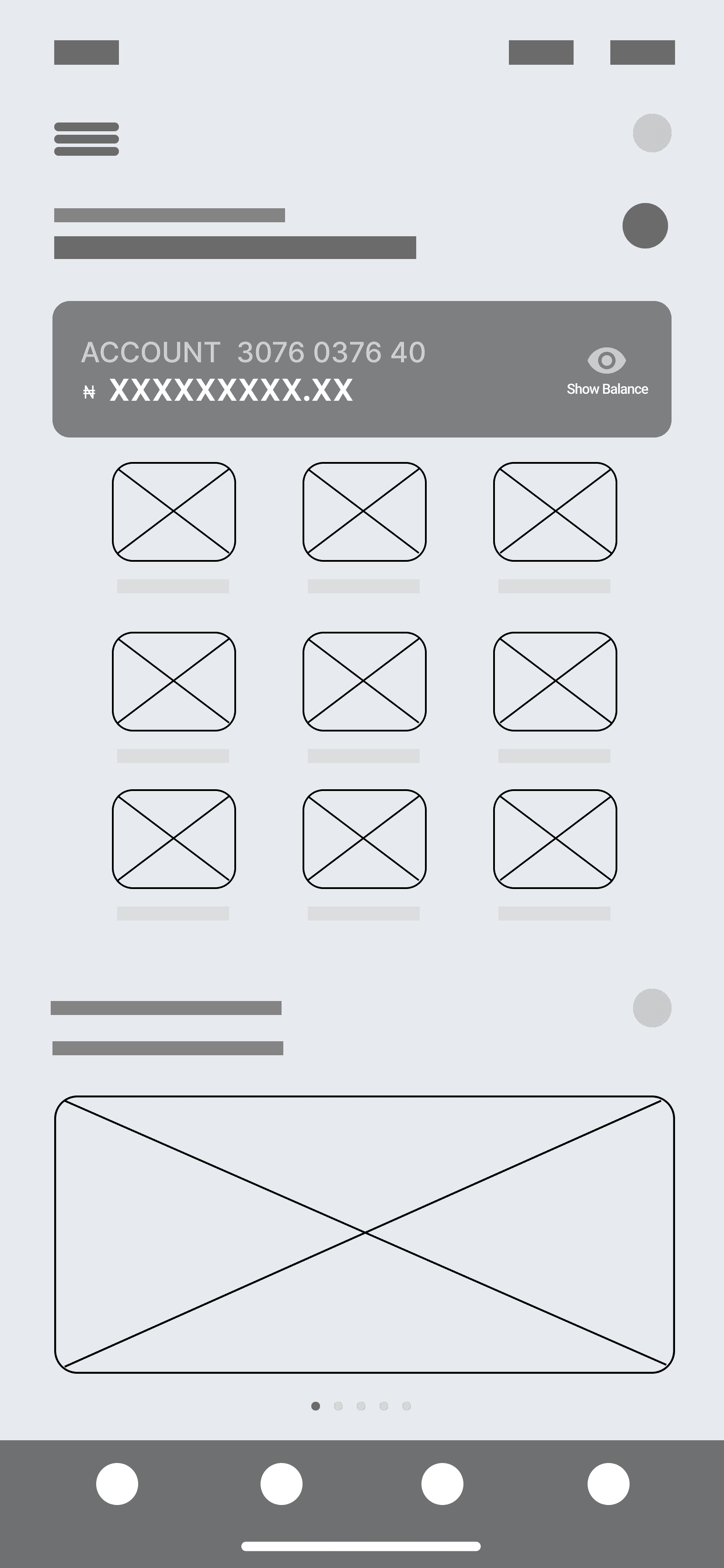
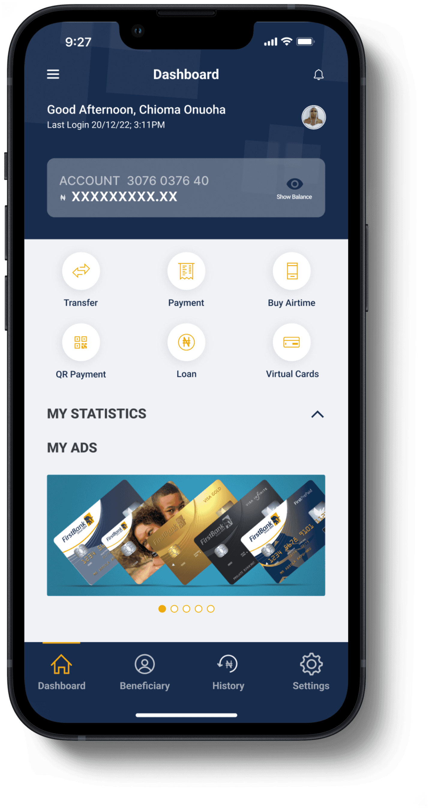
Home screen
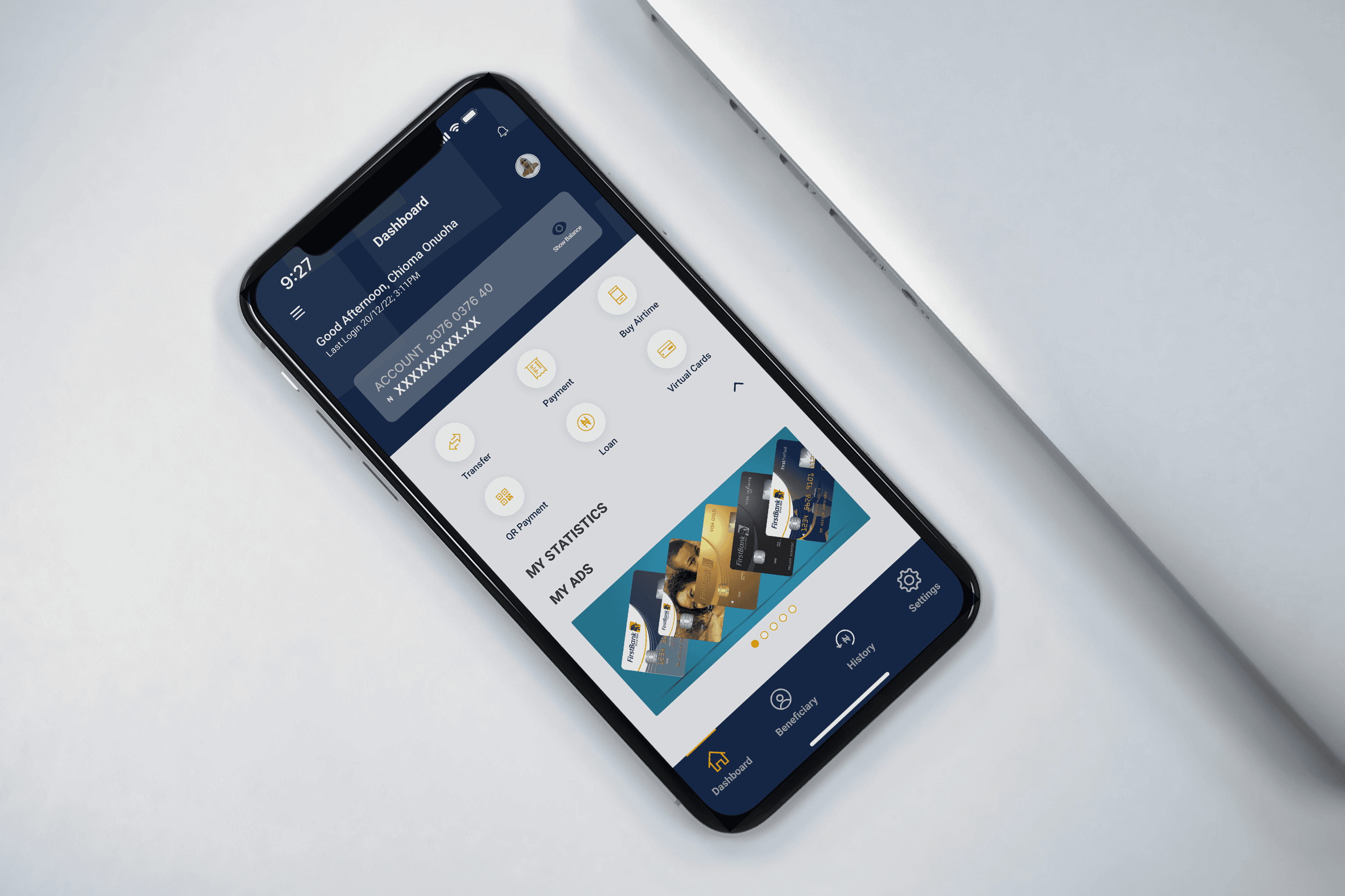
From the home screen, users now have an added an optional toggle to hide or display the account balance, granting users full control over their financial information.


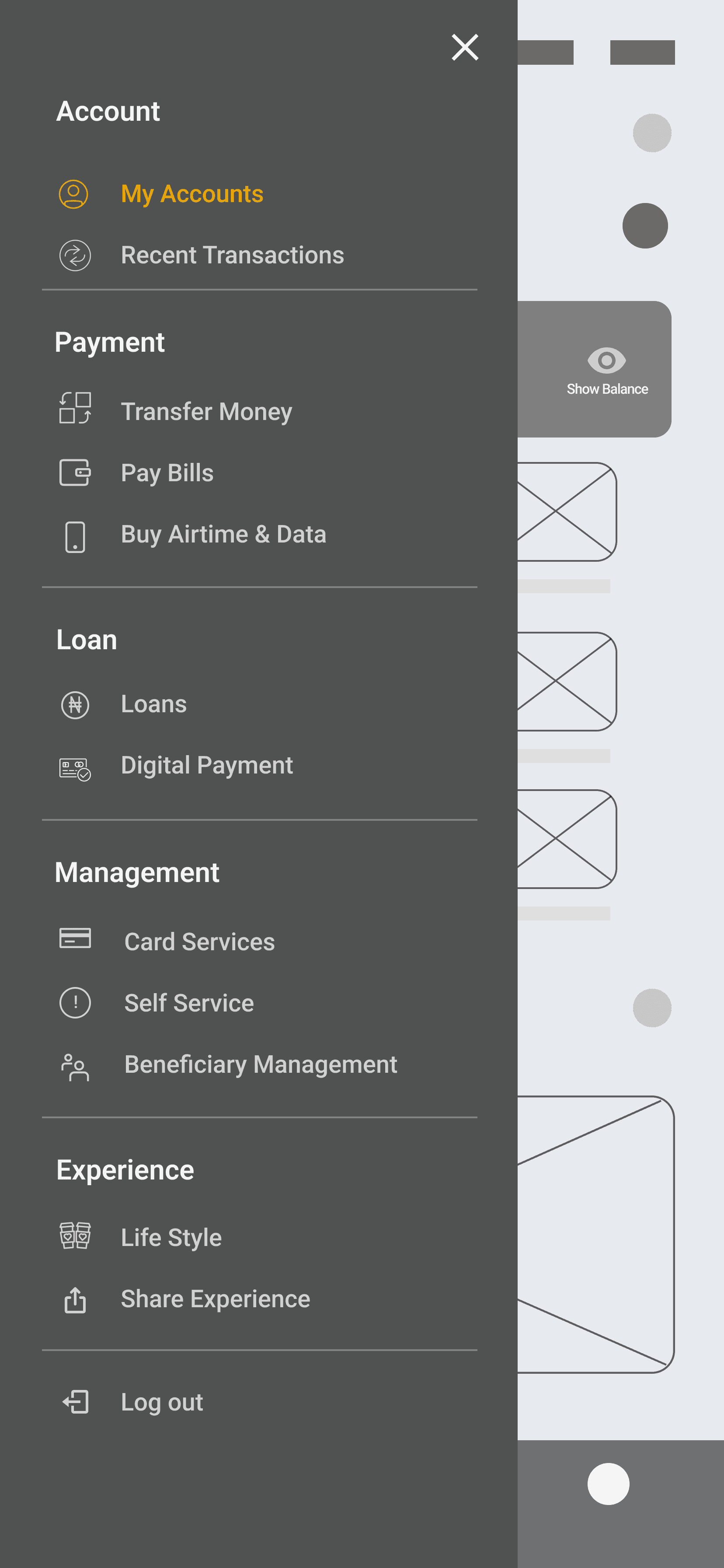
Menu section
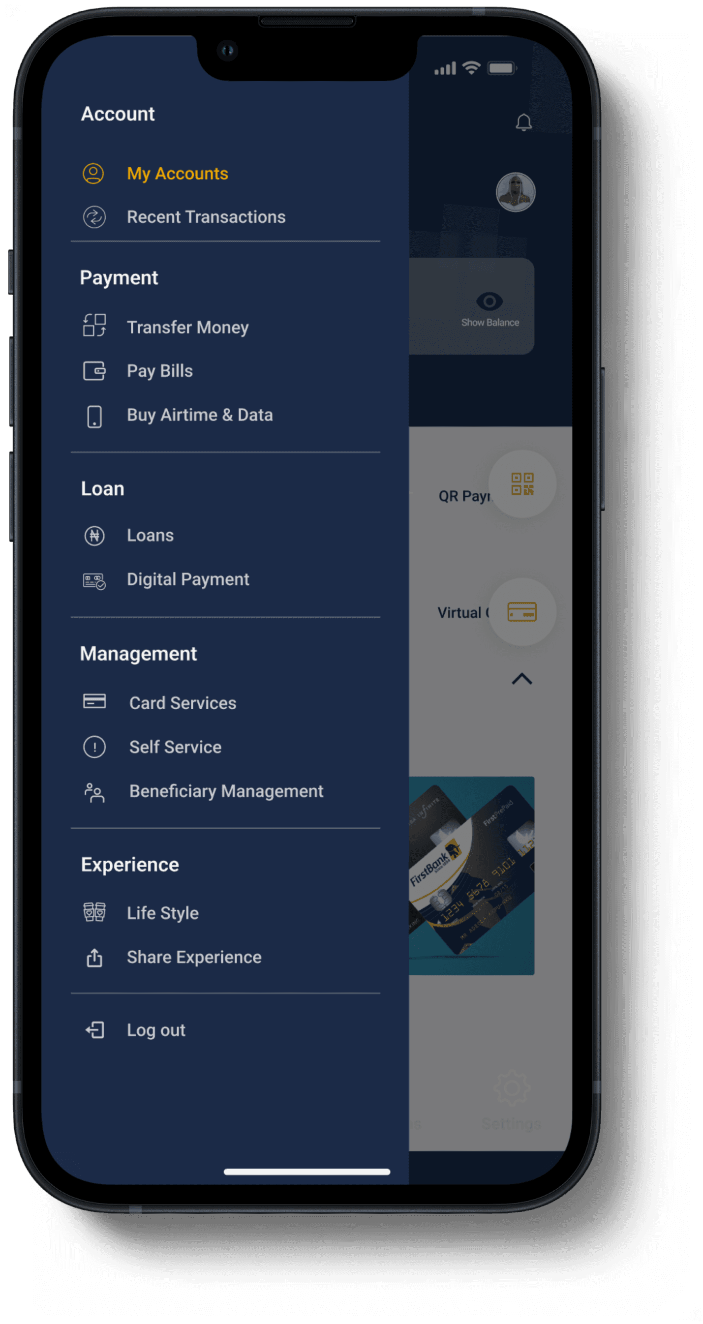
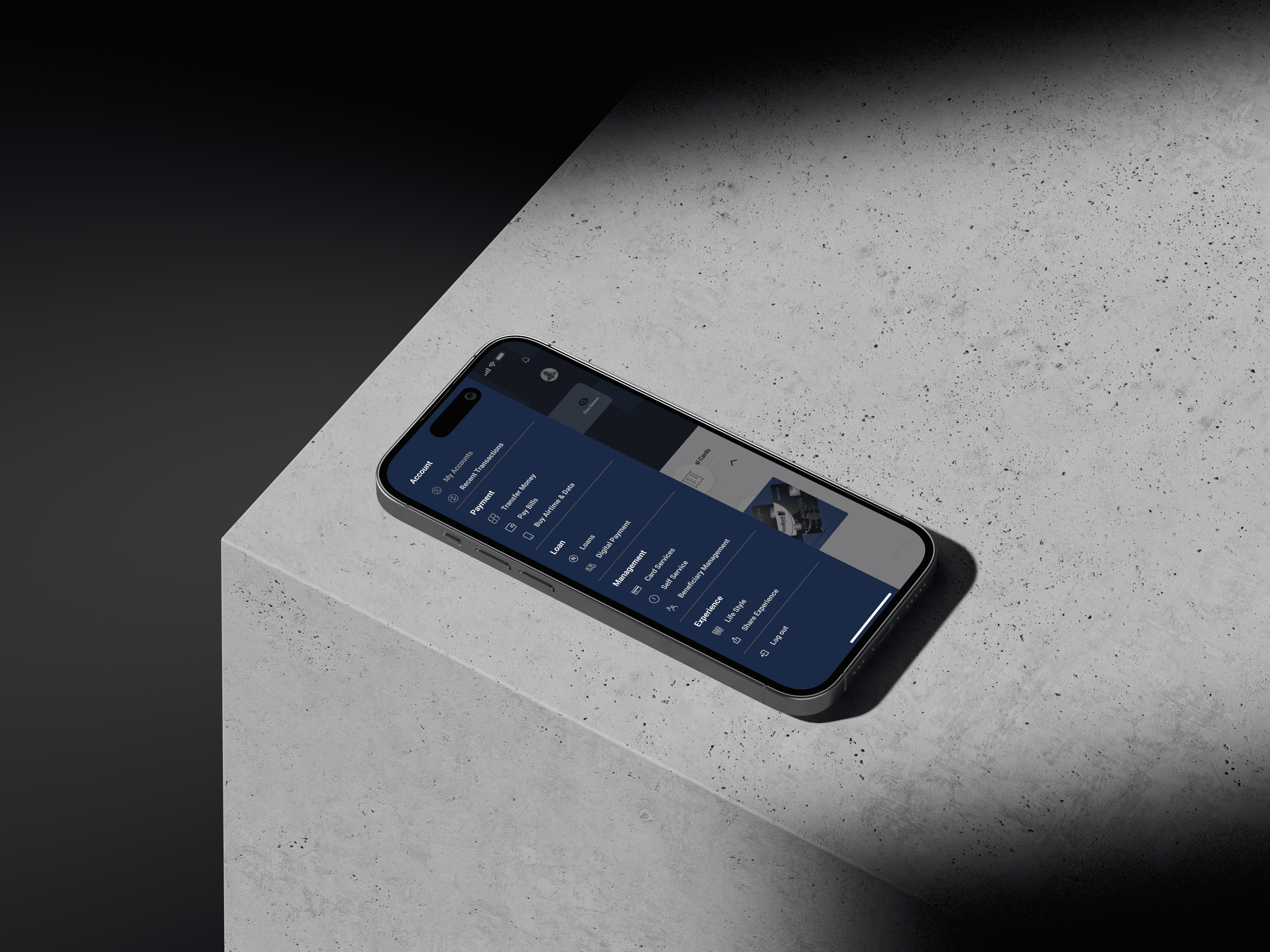
Re-categorised the menu section to organise and group related options and commands in a logical and user-friendly manner, making it easier for users to find and access the specific features and functions they need within the application.


Key Learnings
As a designer, I learned that knowing your target audience's pain points is key to creating an awesome experience. These helped me create a visually appealing and consistent design that aligns with the bank's brand identity and enhances the overall user experience.

Let's bring your vision to life and create something extraordinary!


Pin reset page
This screens allows users who have forgotten their password reset it.


Home screen
From the home screen, users now have an added an optional toggle to hide or display the account balance, granting users full control over their financial information.
Let's bring your vision to life and create something extraordinary!


Menu section
Re-categorised the menu section to organise and group related options and commands in a logical and user-friendly manner, making it easier for users to find and access the specific features and functions they need within the application.


Key learnings
As a designer, I learned that knowing your target audience's pain points is key to creating an awesome experience. These helped me create a visually appealing and consistent design that aligns with the bank's brand identity and enhances the overall user experience.
